4 Graphic Design Tips Straight From the Experts for Print Advertising

Designing for print is a timeless craft that when done right can be as successful as any digital medium. At its heart, any graphic design application is intended to produce attention getting ads that appeal to your prospective customers; the right design choices can achieve this important goal. We have rounded up four tips from professional graphic designers who have extensive experience producing material especially for print. These are the principles that are going to get results for clients seeking graphic design in Rochester, NY.
1. People Will Read – But Not Forever
Contrary to what you might have heard around the water cooler, people really do still read. You can absolutely include text content in your print design without losing people’s interest but a good balance will have to be found. Excessive detail and reiterated information does not serve your audience.
Text can be one of the most powerful features in your design so taking time in its composition will certainly pay off. Do not be afraid of professional copy editing services; expert writers and editors can help you get your message across in a clear and concise manner.
2. Use the Grid to Orient Your Elements
Creating a grid is a basic design technique and it is one that remains a cornerstone of professional design work. Grids help organize material in hierarchies of importance and let designers fine-tune each element to perfection.
3. Experiment With Contrast for Added Impact
Dark text on a light or white background is the typical design choice and for many applications it remains the best option. For some applications, such as the addition of a logo, motto, or other short phrase inverting this scheme can add heightened visual impact. Choose black or another dark color as the background for white print.
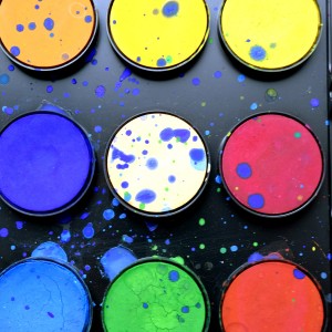
4. Create a Simple Color Palette
Color can add interest and value to any printed material. Create a color palette of just a few coordinated selections to base your entire design on. Although color palettes can have up to a dozen or more colors, most print jobs require just four or five. Choose two harmonious colors to start with, two colors that complement them, and perhaps one contrasting shade for emphasis. Professional graphic designers will integrate the look and feel with your brand into the print ad.
Once again, the purpose of graphic design is to create an attention getting ad that will appeal to your prospective customers. Sundance Marketing applies these and other best practices to develop marketing strategies for our clients. Contact us today to begin.


